Sunday, March 31, 2019

Designing for Information Accessibility

If identifying what information needs to be communicated in a design is the first step in information design. A close second should be identifying how that design will be received. More specifically identifying potential obstacles that could interfere with the design being received. This refers to accessibility. If an audience can't access your design, your message does not get delivered and your attempt at communication fails.

Things that can affect accessibility include vision and hearing impairments or loss, photosensitivity, motor/mobility issues, and cognitive/learning disabilities. Even being distracted or on-the-move can affect a persons ability to receive the information in a design. So how can designers address this?

Image of Universal Design at FujiXerox


Guidelines for Accessibility

The 7 Principles of Universal Design and the Web Content Accessibility Guidelines are two methods designers can use to create more inclusive designs. They both help designers to consider the perspective of all potential users and encourage them to design for all ability levels.

7 Principles of Universal Design 

Equitable Use – Design to accommodate users with diverse abilities (e.g., deafness).
Flexible Use – E.g., accommodate right- and left-handedness.
Simple, Intuitive Use – Simplify complex information. Use a proper information hierarchy, progressive disclosure and effective prompting towards task completion.
Perceptible Information – Optimize readability of vital information and present information redundantly (i.e., use pictures and text).
Tolerance for Error – Arrange elements to minimize accidental actions.
Low Physical Effort – E.g., minimize repetitive actions.
Size and Space for Approach and Use – E.g., accommodate touch target areas for average-sized fingertips. (interactiondesign.org, n.d.)

Web Content Accessibility Guidelines (WCAG)

Perceivable: Can I consume content on my site in different ways? (Having closed captions for a video, for example)
Operable: Can the site function without confusion and without the use of a mouse or complex interactions?
Understandable: Can a user understand how the user interface of the site functions and the information on the site?
Robust: Can different assistive devices (screen readers, for example) understand the website? (Kramer, 2018)

Examples of Accessibility

Closed-captioning is probably one of the first things that comes to mind when you think about accessibility in media. For people with hearing loss closed-captions, subtitles or transcripts are critical for accessing audio information.

This video features Nyle DiMarco, a Deaf advocate, communicating in American Sign Language. While he signs an interpreter translates for a hearing audience. On Youtube subtitles/closed-captioning and a transcript are available.  Seems to cover all the bases, right? Wrong.

Commenters noted problems with the subtitles/closed-captioning, the transcript, and camera angles that made it hard to see the signing. All of which negatively impacted their experience and resulted in lost messaging. Ironically these are the sorts of issues Nyle speaks out against.

Accessibility Best Practices

Creating assistive technologies like speech-to-text software, and reversely text-to-speech for the visually impaired, are in the realm of developers not designers. However, there are steps designers can take to make their designs more accessible.

"Assistive technology (AT) is any item, piece of equipment, software program, or product system that is used to increase, maintain, or improve the functional capabilities of persons with disabilities" (atia, n.d.). 

In the blogosphere this includes correctly using information hierarchies like headings; Providing alt text for images with a brief, concise description of the information therein; Making sure links open in the same window in order to maintain the function of the back button; Ensuring that clickable areas aren't so small that precision is needed to find them; and Eliminating excessive clicking or movement which can fatigue or strain users with motor/mobility issues. 

In the end it is not enough to simply make the effort to be inclusive. Designs must be thoroughly tested, ideally by people with a variety of abilities, to ensure they work as intended. Accessibility is not an extra. It is a critical element for many and beneficial to everyone.


Resources:

Atia. (n.d.) What is AT? Retrieved March 31, 2019 from https://www.atia.org/at-resources/what-is-at/

FujiXero. (n.d)Activities on Universal Design. Retrieved March 31, 2019 from https://www.fujixerox.com/eng/company/social/ud

Fulton, G. (2017, December 03). Accessibility Basics: Designing for Visual Impairment.Retrieved March 31, 2019 from https://webdesign.tutsplus.com/articles/accessibility-basics-designing-for-visual-impairment--cms-27634.

Interactiondesign.org. (n.d.). Accessibility: Your constantly-updated definition of Accessibility and collection of topical content and literature. Retrieved March 24, 2019 from https://www.interaction-design.org/literature/topics/accessibility

Kramer, N. (2018, March 10). A Primer to Web Accessibility for Designers. Retreived March 31, 2019 from https://uxplanet.org/a-primer-to-web-accessibility-for-designers-2c548448c612.

Lambert, S. (2018, April 09). Designing for Accessibility and Inclusion. Retrieved March 31, 2019 from https://www.smashingmagazine.com/2018/04/designing-accessibility-inclusion/.

Soegaard, M. (February 2019). Accessibility: Usability for All. Retrieved March 24, 2019 from https://www.interaction-design.org/literature/article/accessibility-usability-for-all

Sollinger, S. (2014, February 14). Five Golden Rules for Compliant Alt Text. Retrieved March 31, 2019 from https://www.abilitynet.org.uk/blog/five-golden-rules-compliant-alt-text.
TedxTalks. (2018, September 05). Making Education Accessible to Deaf Children | Nyle DiMarco | TedxKlagenfurt. Retrieved March 30, 2019 from https://www.youtube.com/watch?v=U_Q7axl4oXY&index=2&list=LLdg0oD9zxCdhUdw95tvqBYQ&t=623s.

Tuesday, March 19, 2019

Information Design: Interactive vs Infographic

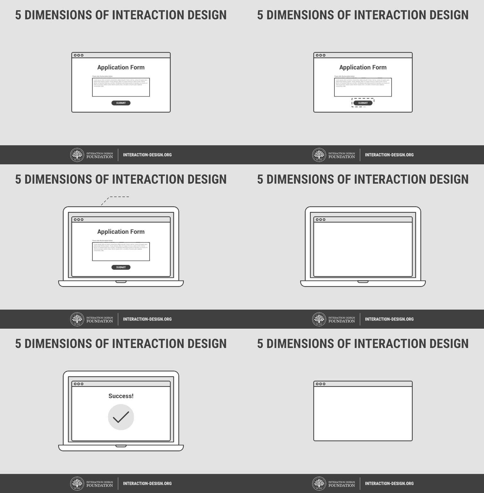
Interactive design and infographics are two methods of visually representing information. They aim to "use striking, engaging visuals to communicate information quickly and clearly" (Nediger, 2018). While graphic and textual elements are utilized in both only interactive enables the user to interact directly with the design. 


Interactive

"Most often when people talk about interaction design, the products tend to be software products like apps or websites" (Siang, 2019). Elements of interaction like roll-overs and clicks have to be coded into the design. This requires programming skills. If a designer does not know how to code they would have to collaborate with someone who does or find a software program that can do the work.

It's important to note that interactive designs interact not only with users but with the users electronic devices as well. Operating systems, browsers, software, device settings, even screen sizes can affect the appearance and/or functionality of an interactive design.

Isabel Meirelles, Assistant Professor of Visual Arts at Northwestern University and author of Design for Information has a prototype of interactive design on her website. The landing page warns users that due to software changes “some of the features no longer behave as planned”. Additionally, in order to access the prototype users must have and enable FlashPlayer.

venngage.com

Infographic

Infographics are not subject to the same technical challenges. Coding skills are not required. Designs can be created using programs, like Adobe Illustrator, or on websites like venngage.com. Designs can also be, and have been for centuries, created on paper, then transferred into digital format if needed.

Infographics are static and unchanging; often posted in jpg or png format to help ensure consistent display across all electronic devices. They are easily shareable. This is particularly significant considering the potential reach of social media. "Aside from being shared, they are often linked to as well when republished by blogs and other websites" (Hines, 2013). These links can direct traffic back to your website for more in-depth content. 


Infographics can be printed without risking the loss of any information in the transfer from digital to print. The same cannot be said for interactive designs. Depending on how much additional information is accessible through the interactive elements, information loss can be great and significantly impact the effectiveness of the communication.

Which is Better

As with all of information design there is no one best option. The data and the needs of the audience should drive the decision on what communication method is used. In deciding between interactive and infographic we must be mindful that "...even though we live a media-saturated society dominated by immersive technology, interaction and animation,...data visualisations should only be interactive if it’s beneficial"(Harris, 2017).


Resources

Complete Beginner's Guide to Interaction Design | UX Booth. (n.d.). Retrieved March 17, 2019, from https://www.uxbooth.com/articles/complete-beginners-guide-to-interaction-design

Harris, M. (2017, December 19). Award-winning infographic designer Nadieh Bremer on how to create powerful data visualisations. Retrieved March 17, 2019, from https://www.digitalartsonline.co.uk/features/graphic-design/award-winning-infographic-designer-nadieh-bremer-on-how-create-powerful-data-visualisations/ 

Hines, K. (2013, January 16). The Beginner's Guide to Creating and Promoting Infographics. Retrieved March 17, 2019, from https://www.crazyegg.com/blog/beginners-guide-to-infographics/ 

Interactive Infographics. (n.d.). Retrieved March 17, 2019, from https://killerinfographics.com/interactive-infographics

Isabelmeirelles.com. (n.d.). Retrieved March 17, 2019, from http://isabelmeirelles.com/infoDesignResource/ 

Isabelmeirelles.com. (2005, July 20). Retrieved March 17, 2019, from http://isabelmeirelles.com/information-design-resource/ 

Magalhaes Gomes, M. (n.d.). Data Visualization - Best Practices and Foundations. Retrieved March 17, 2019, from https://www.toptal.com/designers/data-visualization/data-visualization-best-practices

Meirelles, I. (2013). Design for information: An introduction to the histories, theories, and best practices behind effective information visualizations. Gloucester, MA: Rockport. 

Nediger, M. (2018, November 30). How to Make an Infographic in 5 Steps [Step-By-Step Guide]. Retrieved March 17, 2019, from https://venngage.com/blog/how-to-make-an-infographic-in-5-steps/

Nediger, M. (2019, March 01). What is an Infographic? Infographic Examples, Templates, and Design Tips. Retrieved March 17, 2019, from https://venngage.com/blog/what-is-an-infographic/ 

Siang, T. (2019, February). What is Interaction Design? Retrieved March 17, 2019, from https://www.interaction-design.org/literature/article/what-is-interaction-design 


Monday, March 4, 2019

The Steps of the Information Design Process


Simply stated the ultimate goal of information design is effective communication. The first step in the information design process is identifying what needs to be communicated (aka the problem), to whom, and by whom. A creative brief is then assembled that gives an overview of the problem, the intended audience, and the key project details. The brief will serve as a reference guide and source of inspiration throughout the design process. Once approved by the client the design team creates a broad outline called a sitemap. Then a wireframe or schematic that fleshes it out. The final step is developing and testing prototypes. 


It’s important to note that the sitemap and wireframes are considered planning documents. They should not contain design details. They also should not be too refined or else “…run the risk of confusing your clients into thinking they are looking at visual design. And…inadvertently starting or pre-empting the visual design process before that phase has begun” (Baer, p 73). The same caution should be taken with early prototypes so that testers focus on the information design not the visual design.

Throughout the design process the design team should be referencing back to the brief and getting client approval before moving on to the next step. They should also establish a regular testing schedule. 

The most important step of the process is identifying the problem. This is the foundation for the entire design. An error here can result in the failure of the entire project. In addition to time, effort, and money wasted, you or your firm’s reputation could suffer. Testing regularly throughout the various stages and comparing results to the goals and guidelines established in the creative brief can help identify design flaws or weaknesses before it gets too far along in the process.


Applying the Process


When I created this blog I had not yet learned the steps of the information design process. However, as it is somewhat intuitive I managed to follow most of the steps without realizing it. 

The first step was identifying the problem (create a blog), the intended audience (instructor, classmates), and the content creator (me). The instructor’s blogging assignment instructions and blog assignments would provide the project requirements for a creative brief.

My blog is hosted by Blogger which created the sitemap and wireframes for the blog site. Wireframes could also be developed for the blog posts with varying arrangements of textual and graphical elements.

Retroactively working the problem through the lens of the information design process I realize that each post can be treated as a test. Not only of the graphical and textual design, but the approach to the content as well. I also realize that because this is a class project an interesting dynamic has been created wherein the intended audience can also be considered a focus group as well as the competition. And with everyone working on the same topics differentiation is key. An "ongoing goal should be to continuously develop innovative content and set a unique spin on the topic you['re] blogging about" (Soare, 2017).

Blog effectiveness can be measured in post views, audience engagement, and direct feedback from the instructor and classmates.


Resources
1344296. (2017, April 3). Retrieved March 4, 2019, from https://pxhere.com/en/photo/1344296

Baer, K. (2008). Information design workbook: Graphic approaches, solutions, and inspiration. Rockport: Rockport.

Dance, A. (2018, July 23). 11 Strategies for Successful Blog Content in Any Industry. Retrieved March 4, 2019, from https://bizzmarkblog.com/strategies-successful-blog-content-any-industry/

Manning, L. (n.d.). Sketchbook. Retrieved March 4, 2019, from https://www.flickr.com/photos/laurenmanning/6632169501 (Originally photographed 2011, November 27)

Olenski, S. (2015, December 23). 7 Strategies To Help Build The Perfect Blog For Your Business. Retrieved March 4, 2019, from https://www.forbes.com/sites/steveolenski/2015/12/23/7-strategies-to-help-build-the-perfect-blog-for-your-business/#26d3e3cb2aac

Ramsay. (2017, September 26). A Proven Blogging Strategy that Works in Any Niche. Retrieved March 4, 2019, from https://www.blogtyrant.com/blogging-strategy/

Ramsay. (2019, January 01). Starting a Blog: A Complete Guide for Serious Beginners in 2019. Retrieved March 4, 2019, from https://www.blogtyrant.com/start-a-blog-2014/

Soare, D. (2017, December 15). 11 Blogging Strategies to A Successful Blog in 2019. Retrieved March 4, 2019, from https://www.drsoft.com/2017/12/15/successful-blogging-strategies/